
What is LESS Space?
LESS Space is a set of classes that helps front end developers make write less CSS while positioning an element on different viewports sizes.
There are predefined margin and padding values and different breakpoints of screens that helps to set values on different sizes of screens without touching CSS @media attribute.
Getting deep with an example
Let's assume we have a sidebar and content that floated on same row. We want them to collapse under 768px width and lower screen sizes, and make the vertical space between them bigger. For example, sidebar covers 25% width of container, and content element covers %75 width of container. I set margin-bottom attribute to 20px both element and below 768px screen width, i want their margin-bottom attribute will be 40px.
How we do it without Less Space?
These are the code blocks i used to write before find a solution to this situtation.
I assume that you're using Bootstrap, but doesn't matter you use another framework or doesn't use it at all.
HTML Code
<div class="container">
  <div class="row">
    <div id="content" class="col-md-8">
    </div><!-- content -->
    <div id="sidebar" class="col-md-4">
    </div><!-- sidebar -->
  </div><!-- "row" -->
</div><!-- "container" -->
CSS Code
#content {
  margin-bottom: 20px;
}
#sidebar {
  margin-bottom: 20px;
}
@media(max-width:767px) {
  #content {
    margin-bottom: 40px;
  }
  #sidebar {
    margin-bottom: 40px;
  }
}
On desktop and tablet devices sidebar and content elements' margin-bottom attribute is 20px; on 768px and lower screen sizes, margin-bottom attribute will be 40px according to this sample.
Code with Less Space
We don't need to write a single line of CSS.
HTML Code
<div class="container">
  <div class="row">
    <div id="content" class="col-md-8 xs-mb-40 md-mb-20">
    </div><!-- content -->
    <div id="sidebar" class="col-md-4 xs-mb-40 md-mb-20">
    </div><!-- sidebar -->
  </div><!-- "row" -->
</div><!-- "container" -->
As you noticed, there two additional class with bootstrap column classes. These are xs-mb-40 and md-mb-20.
If you're a Bootstrap <3 lover just like me, you're already familiar with Bootstrap's grid structure and column classes what mean.
You don't need to know Bootstrap or any other CSS Framework to understand xs-mb-20 actually does. Let's examine these 3 parted class with a visual diagram.
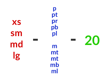
Red area:
This section defines which viewport that element belongs right now.
xs(extra small: 480px) Mobile phones and bigger screen sizes..
xsrepresents global viewport size by the way. If we want margin or padding values stay same on all screen sizes, we usexsto achieve that.sm(small: 768px) Tablet devices and bigger screens.md(medium: 992px) Desktop and bigger screenslg(large: 1200px) Extra wide viewport sizes.
Blue area
This section defines the attribute that you want to use, either margin or padding
ppaddingptpadding-topprpadding-rightpbpadding-bottomplpadding-leftmmarginmtmargin-topmrmargin-rightmbmargin-bottommlmargin-left
Green area
This is the integer section that you want to set.
- It could be zero "0"
- Only digits.
- Minus values will not be accepted. (I Didn't define them consider its using rate.)
USAGE AND DOWNLOAD
DOWNLOAD LINKS
less-space.css less-space.min.css less-space.less sass-space.scss
Install with Bower
bower install less-space
Clone with Git
git clone //github.com/Eomerx/less-space.git
You can use Grunt to recompile css with your own breakpoint values. Or use the generator at the end of the post.
USAGE
If you just want to CSS; find less-space.css file under dist folder and call it from your html with other stylesheets.
If you use Bootstrap and LESS together; navigate to src folder and copy less-space.less file to Bootstraps' less files folder. Edit the bootstrap.less file and add @import "less-space.less"; line at the end of the file. You have to delete the lines on top of less-space.less file starts with @screen-*. These breakpoint values are already defined on Bootstrap's variables.less file.
If you use LESS with other CSS Framework or not using a framework; navigate to src folder and copy less-space.less file to your custom less files folder. Edit your main less file (mine is style.less) and add @import "less-space.less"; line wherever you want. It will be compiled with your other styles.
If you use SASS with Bootstrap, other CSS Framework or not using a framework; navigate to src folder and copy sass-space.scss file to your custom less files folder. Edit your main sass file (mine is style.scss) and add @import "sass-space"; line wherever you want. It will be compiled with your other styles.
LESS File Github Gist
SASS File Github Gist
Live Preview from Codepen
This preview shows that how Less Spaces affects on margin and padding values on different widths of screens. Red area represents margin value and Green area represents padding value. Resize the browser and see the changes.
See the Pen Less Space by Ömer Aslanbakan (@Aslanbakan) on CodePen.
LESS Space CSS Generator
What if you use Stylus to compile your stylesheets, or not using any other CSS Proprocessor at all?
This small app generates Less Space CSS classes using your custom breakpoints' values.
Published by Ömer Aslanbakan on